
Google Maps makes it easy to embed a map in your own website.
However, by default, Google Maps doesn’t provide responsive support.
In this short tutorial, I’m going to show you how to make your maps responsive, using just a few lines of CSS. This technique will work on any website platform.
Step #1. Get the Google Maps Embed Code
- Go to Google Maps.
- Find the map area you want to use on your website.
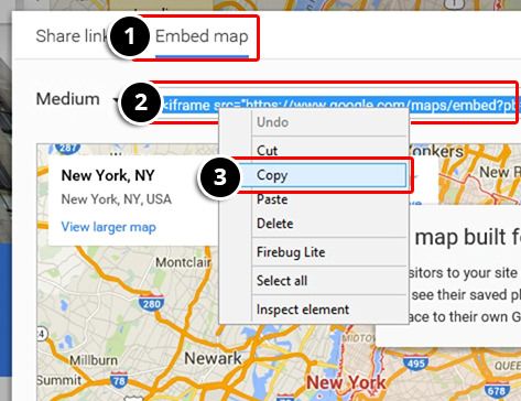
- Click on the “Share” link.

- Choose “Embed map”.
- Select the iframe code.
- Right click and copy the embed code.
Step #2. Use the Google Maps Embed Code
Paste the embed code in your website. It will look similar to this:
<iframe src="https://www.google.com/maps/embed?pb=!1m18!1m12!1m3!1d386950.6511603643!2d-73.70231446529533!3d40.738882125234106!2m3!1f0!2f0!3f0!3m2!1i1024!2i768!4f13.1!3m3!1m2!1s0x89c24fa5d33f083b%3A0xc80b8f06e177fe62!2sNueva+York!5e0!3m2!1ses-419!2sus!4v1445032011908" width="600" height="450" frameborder="0" style="border:0" allowfullscreen></iframe>
Step #3. Modify the Embed Code
Add a div tag around the embed code. Use the CSS class map-responsive so that your code now looks like this:
<div class="map-responsive">
    <iframe src="https://www.google.com/maps/embed?pb=!1m18!1m12!1m3!1d386950.6511603643!2d-73.70231446529533!3d40.738882125234106!2m3!1f0!2f0!3f0!3m2!1i1024!2i768!4f13.1!3m3!1m2!1s0x89c24fa5d33f083b%3A0xc80b8f06e177fe62!2sNueva+York!5e0!3m2!1ses-419!2sus!4v1445032011908" width="600" height="450" frameborder="0" style="border:0" allowfullscreen></iframe>
</div>
Step #4. Add your Google Maps CSS
Now add some CSS properties inside one of your stylesheet files:
.map-responsive{
    overflow:hidden;
    padding-bottom:56.25%;
    position:relative;
    height:0;
}
.map-responsive iframe{
    left:0;
    top:0;
    height:100%;
    width:100%;
    position:absolute;
}
Your maps now will be responsive. Try resizing your browser to see it in action.